Your Cart is Empty
100+ ARTISTS | 1,000+ ARTWORKS | KULTURE SHOP IS NOW CLOSED
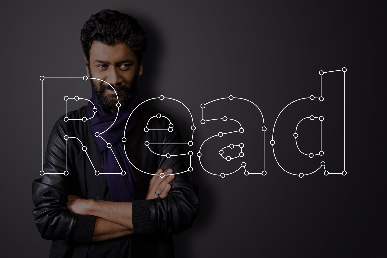
Shiva: I got into design through a love for narrative art — comics and cinema. I actually wanted to become a comic book artist or an animator and was guided to applying to design school as a way to learn animation. I really had no idea what graphic design was at the time. In my foundation year at DJ Academy of Design (Coimbatore, where I did my undergraduate course in Communication Design), I really found myself, so to speak. Typography and Graphic Design took precedence to animation and there has been no looking back since.

Whatever we are doing, letters and content are what we see the most on a day to day basis — on our various devices, on the streets, newspapers etc. Content is communicated through typography. I felt it was fascinating that we could communicate through something as basic as that: the shapes of the letters that people read. Designing type is interesting because of how constrained it is. The ‘a’ should, in the end, look like an ‘a’ otherwise it becomes illegible or loses its semantic meaning. So I’m really just playing with a very strict system and trying each time to explore the same things in a different way. Once I started designing type for real, I fell in love with its complexity and mundanity. It's meditative to sit and toggle bezier handlers (nods that are used to shape a font's form) for hours and hours. Coming back to my love for storytelling, it never subsided even after leaving animation and continues in my other work today. It is the basis of everything I do, whether it’s a typeface or an exhibition.


Typecon 2015 in Denver USA


Top: From Kulture Shop @ Design Yatra 2015 - Create Something Collaboration
Right: “aa” by Shiva with a touch of cheeky wit by Hanief with the eyes added straight after. Now that’s the spirit of collaboration!
Shiva: I mainly work in the digital medium, Type design especially. But two analogue mediums that I really enjoy are Screen printing and Stencil+Spray painting, both of which I haven't explored since college. I look forward to getting back to them. A medium that I've never tried but am very curious about is Linocuts.

Shiva: The "8" piece I've done for KS is a special one. It is the first use of my experimental, quasi-intelligent typeface Labyrinth (working title), a font I've been working on with my mentor Tal Leming for over 3 years now. It is inspired by geometric Kufic calligraphy style and powered by advanced opentype features to enable its interlocking letters. Each letter adapts itself to the letter typed before/after it. Making unexpected wordblocks and patterns. The 8 is made up of just typing "LLE" around a path. Labyrinth will release soon from Dutch type foundry Typotheque.


Seen Here (L-R): T-Shirt design submitted for Kulture Shop's Typography Theme morphs itself around Kulture Shop's products creating an interesting bold monochrome patterns.
Photo Credit: Priyanka Mehta
Making unexpected word blocks and patterns. The 8 is made up of just typing "LLE" around a path. Labyrinth will release soon from Dutch type foundry Typotheque.


Top: 12345 Greeting Cards, Zero Mugs, Goa Art print and Khoon Ki Baarish T-shirt
Shiva: There are several ongoing projects: I’m working on the branding and campaign for the Arcasia Awards for Architecture 2017. I’ve also started teaching, and returned to my alma matter (at DJAD) and took a course on experimental publication design.

Working on several typefaces: My first serious text serif, a family of sans serifs that includes a monospaced variant and a Devanagari version and two stencil typefaces — One brutal and the other playful. And of course, plenty of new things for Kulture Shop!

Going freelance in 2017 has been liberating. I love working on multiple things at the same time and let each one feed off the energy of the other, which was not possible in an office environment. Especially when I want to create a very plural practice in terms of projects, it has been great. It also gives me a lot of time to pursue personal projects.
Shiva: I have always been interested in varied things. Illustration, graphic design, publications, typefaces...And have always aimed that my work should reflect this: That one doesn’t have to be constrained to a certain field with its limitations. I feel these different fields are tools of communication and all tools one is interested in are equally important to know. I enjoy the plurality of such a practice. My website was designed to show this aspect.

Orwellian began as an experiment in trying to interpret themes from George Orwell's classic "1984" into a typeface.
Two people I admire who have mastered such a practice are WA Dwiggins (Graphic Designer, Typographer, Letterer, Type Designer, Puppet Maker, Graphic Design pioneer… and also the guy who coined the term “Graphic Designer”) and Satyajit Ray (a master film maker, graphic design pioneer in India, illustrator, musician…). These guys were not your regular jack-of-all-trades, but masters of these various fields and wielded this power to communicate in the most interesting ways.
Shiva: I would ask them to not rely on trends and to look into the theoretical aspects of type while perfecting the craft. Type Design is as much craft (reliant on the technical production) as it is designed. Both these aspects, the thinking and the making, are crucial to making a well-rounded typeface. Many designers today detail their processes in engaging process essays (Typotheque, Klim, Ohno Type, Lost Type etc) that prove to be very helpful to young designers. There is so much discussion around type today on blogs and websites which are really great too (Typographica, Alphabettes etc.). It is also very important to learn about the history of typography and type production, book making, printing and editorial design.
Check out Shiva's various fonts.
Find Shiva Nallaperumal on Kulture Shop.


