Your Cart is Empty
100+ ARTISTS | 1,000+ ARTWORKS | KULTURE SHOP IS NOW CLOSED
Sanchit: As a child, I was a quiet observer. Most of my skill development started at the early age of 4, when I would try to copy the cartoons I watched or read about in TV shows and comic books. I never practiced ''drawing" as much as I practiced "looking". Being accepted into NID helped me take my first step towards a career in design. At NID, I pursued my studies as a communication designer. I never chose to be a pure illustrator and have always tried to switch roles according to what a project requires. I love the design process and find limitations in a focused skill based solution.

Cartoon drawing by a 5 year old Sanchit
Sanchit: Key moments have always been about what other people have done for me and not about the work I have done. Working under Satya Rajpurohit, Itu Chaudhuri and Rajesh Dahiya have been the highlights in these 4 years. These experiences have helped me become a designer and not just a visual artist.

Sanchit: I don’t have a favorite medium. In my past projects, I have used hand skills, 3D rendering, photography, vector drawing, motion, and sound. I enjoy creating unique solutions for client projects. Most of my past personal work has been typographic, but I try to move away from it constantly. I aim to make multi-genre art. In the future, I would like to explore space and physical materials. At Struckby we are working on a number of public installations.

"Hardwork Pays The Rich" is a comment on privilege
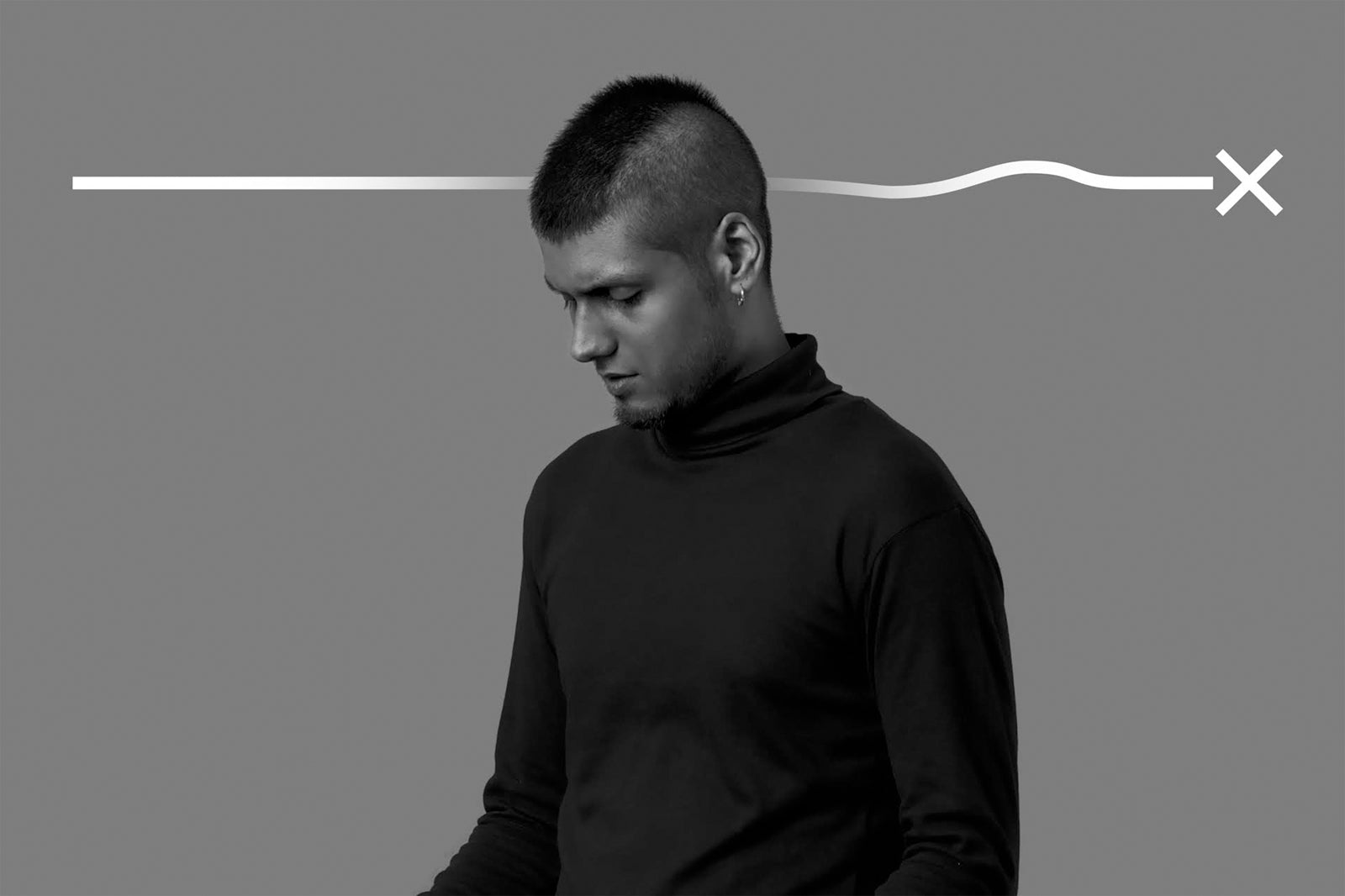
Sanchit: If you are a Graphic Designer, you must know how to set type. Designing communication almost always needs type hence it is a large part of my professional work. In my personal work, I don’t want any "typographer" or "type designer" tags. I draw letters amongst other things.

Darkstone is a hybrid black letter display font which combines features of the Fraktur and Old English. Darkstone is great for labels, mastheads, branding, advertising, posters, etc.
Akhand Devanagari is a family of compact mono-linear typefaces. The family includes 8 font styles in upright and 8 in italics. Each of the 16 font styles contains 892 glyphs, offering full support for conjuncts and ligatures. It was developed with The Indian Type Foundry, 2012. It was later re-appropriated and released as Khand for Google fonts.

Turned to Bits — From a series mostly depicting abstract surreal landscapes, where meaning isn't absolute; it is moving consciousness from the organic sphere to the digital.
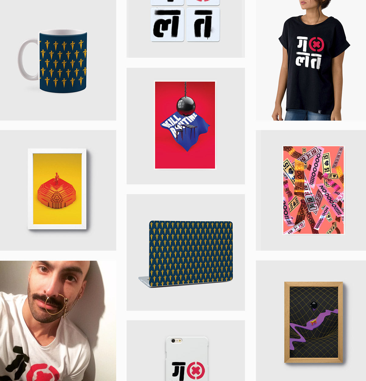
Seen Here (L-R): Katar - Mug | Galat - Coaster Set | Galat - Women Tee | Turned to Bits - A5 Frame | Kill Routine - Art Print | 5555 - Art Print | Galat - Mens Tee | Katar - Laptop Skin | Galat - Coaster Set | Singularikitty - A5 Framed
Sanchit: Prateek Upreti and I formed Struckby in 2015. Right now early in our careers, we want to experiment with work environments and culture. Struckby is a multidisciplinary practice. We create a new team for every project. Since all projects require specific expertise, we feel this format keeps the design process pure.

The Death Penalty Research Project is an attempt by National Law University, Delhi at documenting the socio-economic profile of prisoners sentenced to death in India and also at understanding their interaction with various facets of the criminal justice system. The report won the CII Design Excellence Award in 2016 under the publication design category.
Sanchit: One half of the brief was about creating an alternative ad-wing under AIB while the other half explicitly demanded that people should look at the logo and say “Hmm. Nice Logo” :) The Vigyapanti logo was designed to fit into their existing visual assets. The lettering is wide and sharp. To avoid a complete boxed and static appearance the strokes have slight bends which make the logotype softer.

AIB Vigyapanti Branding by Struckby — If 0 was the College Humour logo and 10 was the BBC logo, we created a 7.
Sanchit: "Kill Routine" represents what I do every day in my personal and professional work. Loops and repeating patterns make me stagnant. This thought just formed a visual where the desk is a metaphor for stagnation.
The artwork doesn’t say desk jobs are bad, only that they should be punctuated with other work which can make your time at the desk more rewarding.
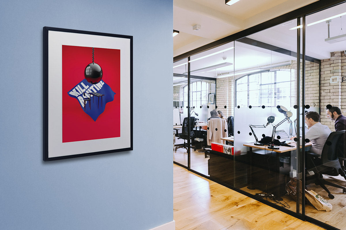
Kill Routine - A2 Framed Art Print — Kill your routine or die with it.
Find Sanchit Sawaria on Kulture Shop.


